Fueling differentiation.
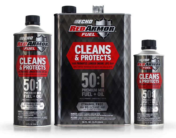
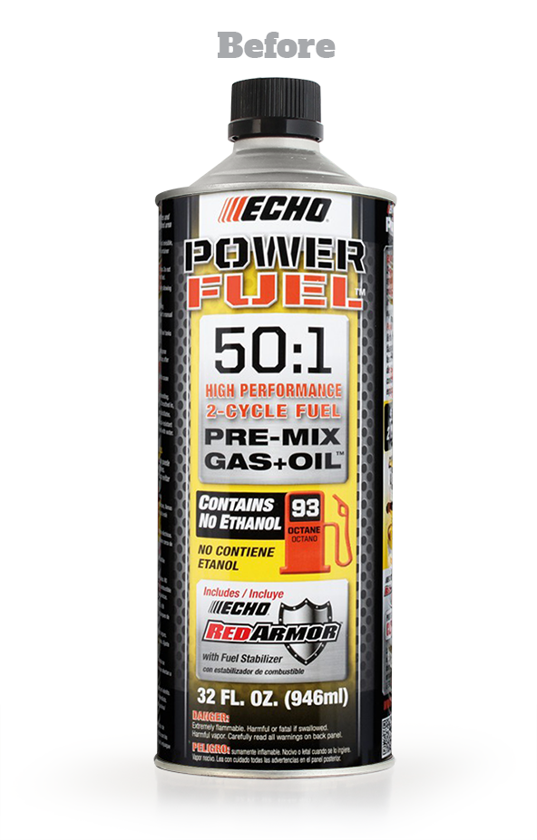
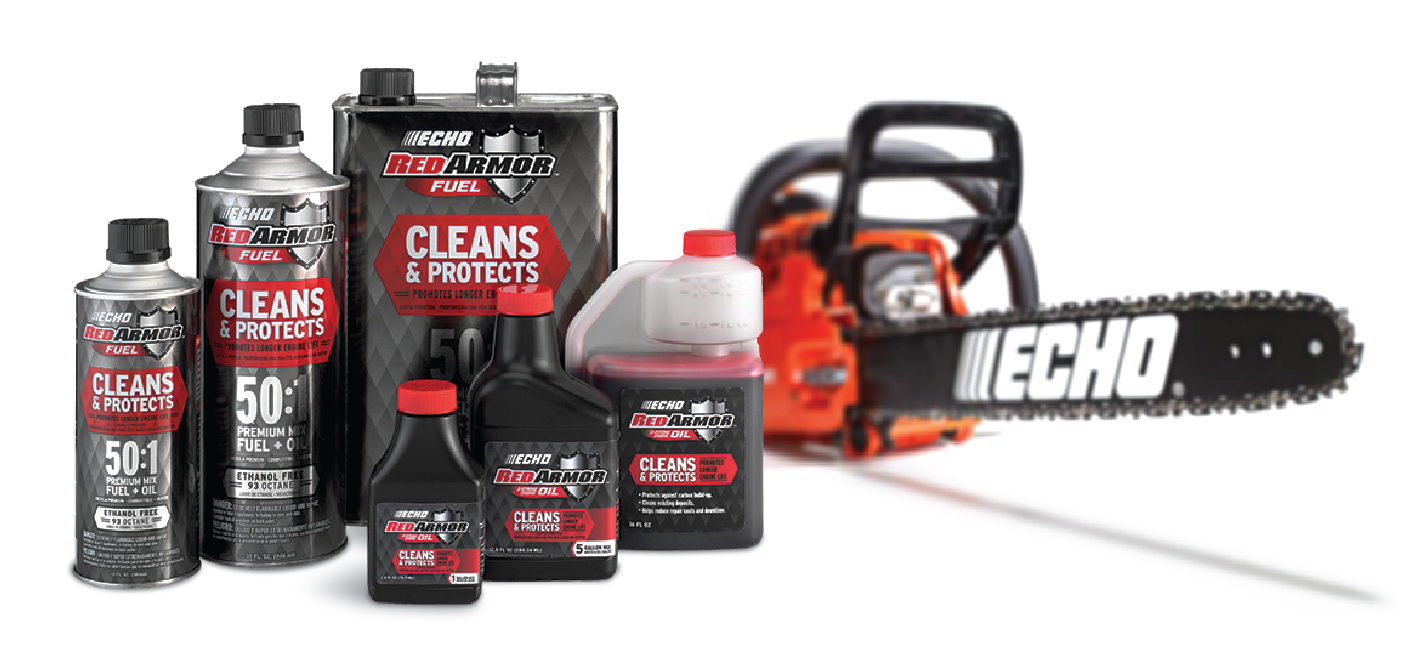
ECHO is a recognized leader in professional outdoor power equipment. But their aftermarket accessory packaging didn’t reflect the innovation and performance of the products they held. First, we redesigned their pre-mixed fuel packaging to give it an award-winning look and focused message deserving of its best-in-class performance.
SERVICES
BRAND STRATEGY
TAGLINE
NAMING
VISUAL IDENTITY
PACKAGE DESIGN
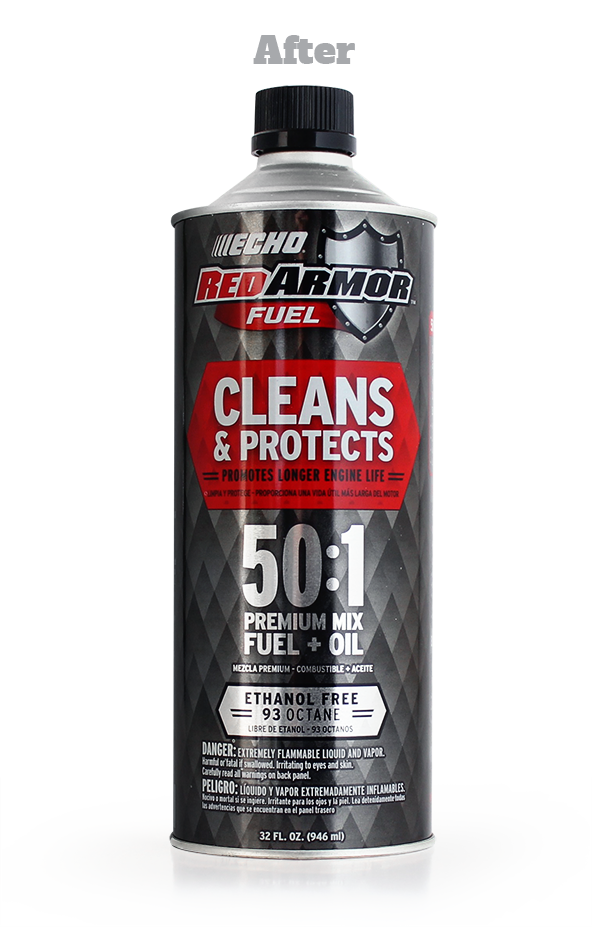
Elevating An Ingredient Brand
Red Armor™, ECHO’s proprietary engine treatment ingredient, keeps engines running longer. Yet you couldn’t tell this from their previous packaging. Our solution was to make it its own sub-brand—capitalizing on existing brand equity and paving the way for a host of new product extensions.


The Ultimate Line Extension
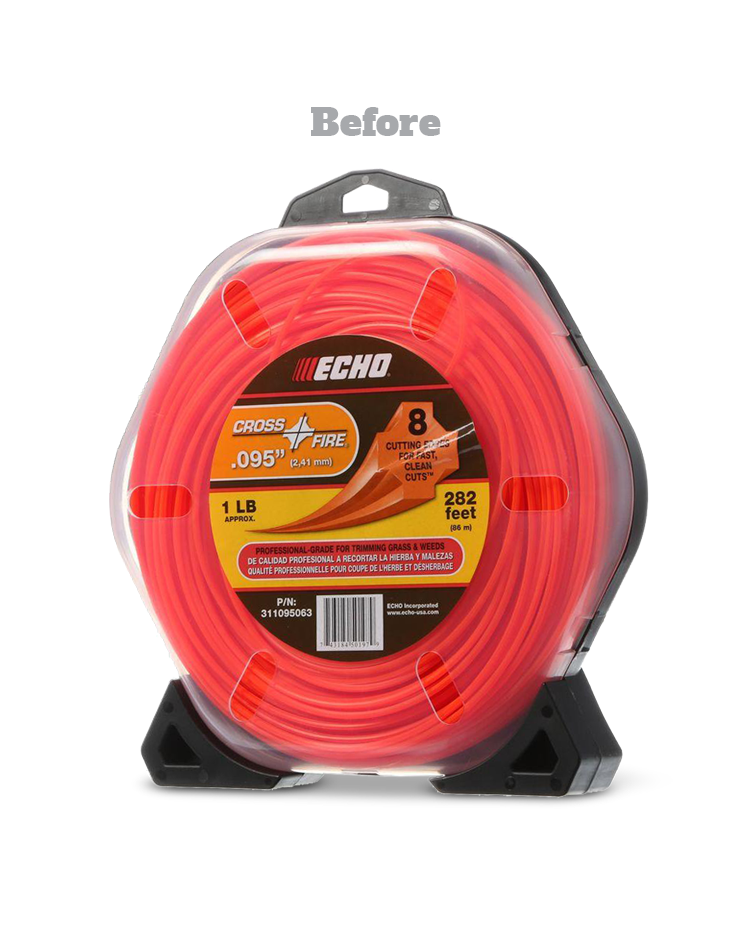
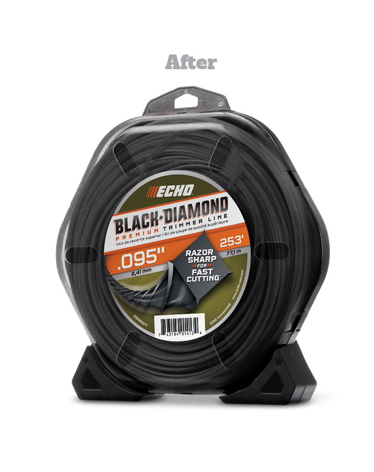
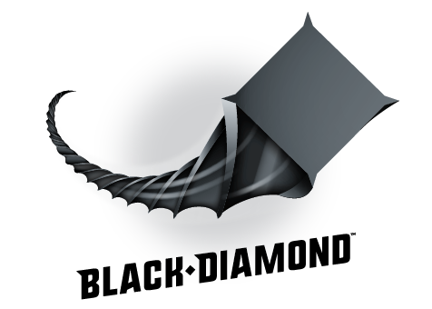
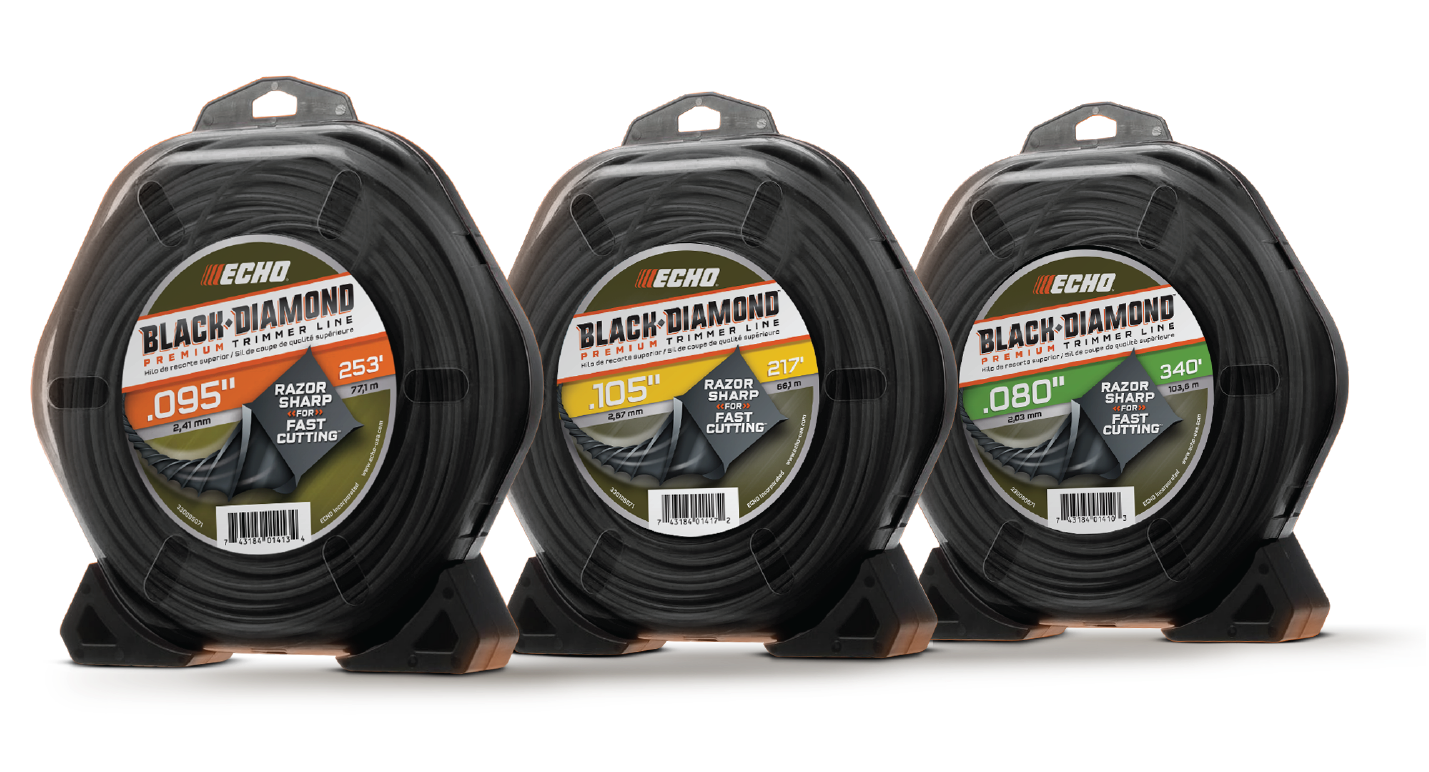
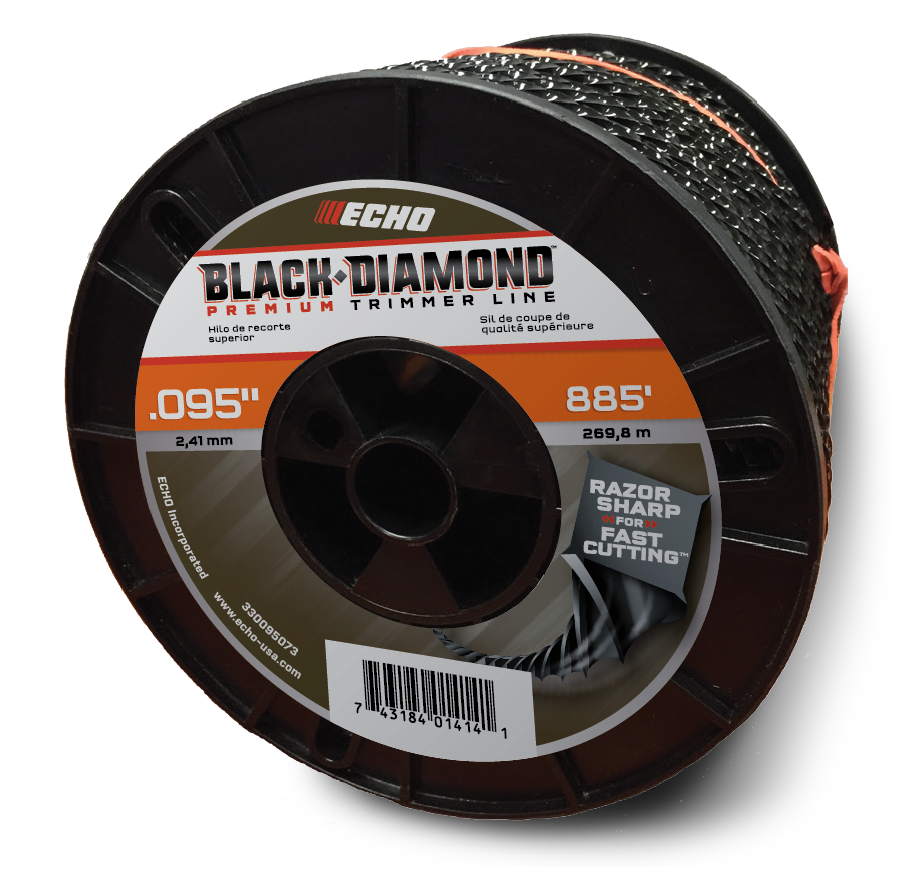
ECHO then challenged us to create an attention-grabbing new tier for their string trimmer offering which had to rise above, yet live alongside their existing product line-up. The Black Diamond name was a no-brainer — sharp, durable and descriptive for customers’ to easily identify and ask for. The final design is more aggressive and dynamic, while retaining just enough of the old design to make it easily shoppable within the set.
